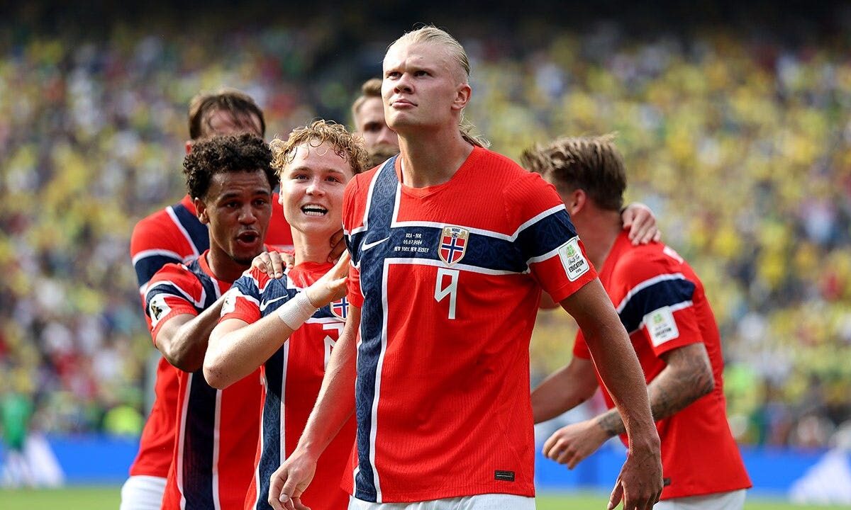
The Norway 2026 World Cup kit is immediately recognizable: a bold red Nike jersey with a blue Nordic Cross that reads as national shorthand on television and in stadiums. The main visual — a cross shifted toward the hoist and rendered with a subtle, tonal pattern — rewards a closer look with details inspired by medieval wood carving.
Fox News’ reporting on the kit notes that designers intentionally combined a striking primary palette with historical motifs to produce a shirt that performs on the field while carrying layered cultural references (Fox News, Outkick Sports).
What the Norway 2026 World Cup kit looks like
The Norway 2026 World Cup kit is a bold red shirt featuring a prominent blue Nordic Cross across the front. The color scheme follows Norway’s traditional home colors: a red field with blue and white accents. The cross is larger than a typical crest element, running across the chest rather than sitting as a small emblem.
On closer inspection the cross contains a tonal texture that the design team says echoes carved ornamentation, allowing the motif to be visible in product photography and close-up shots while remaining legible from the stands. The silhouette uses Nike’s contemporary national-team cut — tapered and athletic — with restrained brand placement so the historical elements remain the focal point.
Historic symbols behind the design
According to Fox News’ coverage, the kit’s visual language draws on two historic sources: the Nordic Cross and decorative work associated with Urnes Stave Church. The report attributes the Nordic Cross reference to the long tradition of cross-based flags in Scandinavia and links that iconography to the region’s medieval Christianization (Fox News).
Fox News’ piece also points to Urnes Stave Church — a Norwegian medieval church often dated to the 12th century in reporting — as the source for the jersey’s interlaced, animal-and-spiral motifs. Designers, as described in the coverage, said those carved patterns inspired the jersey’s tonal surface treatment inside the cross. The article frames these choices as historical and cultural references rather than assertions about contemporary religious practice.
Where meanings are debated, the reporting stresses interpretation: designers present the motifs as part of Norway’s visual and material history, and commentators vary in how they read those connections (Fox News).
How Nike made the shirt
Fox News reports that Nike integrated historic artwork into the fabric rather than applying obvious printed graphics. The Urnes-inspired motifs appear as a woven or sublimated tonal pattern within the cross, a technique designers said keeps the detail readable in close-up photography while avoiding visual clutter from a distance.
That approach, as described in coverage, preserves the jersey’s performance characteristics — breathability, stretch and durability — while embedding the reference into the textile treatment. Nike’s goal, per the reporting, was to balance broadcast visibility with crafted detail so the shirt works in play and in still images.
Public reaction and cultural context
Response to the kit has been mixed, and Fox News’ story summarizes both praise and critique. Many fans and commentators applauded the aesthetic: the cross was called a clear national marker and close-up images drew attention to the subtle Urnes pattern. Supporters framed the shirt as an artistic nod to Norway’s past.
Other observers questioned the use of Christian-associated imagery on a national team jersey. Fox News notes that modern Norway is largely secular in practice even as historical and legal documents reflect Christian heritage; critics described the kit as cultural signaling while supporters emphasized historical reference. The reporting treats these as differing perspectives rather than adjudicated facts (Fox News).
The design conversation ran alongside other reporting about Norway’s presence in the U.S.; for example, a linked report quoted the headline “WE MUST MOVE” in relation to a hotel-room change after noise complaints. That logistics item was reported separately but contributed to wider social-media attention around Norway’s delegation (Fox News’ coverage links both stories).
Key takeaways
The Norway 2026 World Cup kit uses a bold red field and a blue Nordic Cross to create immediate national identity. Fox News reports that the design team intentionally incorporated a tonal pattern drawn from Urnes Stave Church carving motifs to add historical texture without dominating the shirt’s performance or sponsor areas.
Nike’s textile treatment embeds the motifs into the fabric so the jersey performs like a modern match shirt while carrying visual links to Norway’s medieval art and cultural history. Public reaction combines admiration for the design with debate over the use of religiously rooted symbolism in contemporary national sportswear.
FAQ
What happened with Norway 2026 World Cup kit?
Nike released a red home jersey for Norway that features a blue Nordic Cross with a subtle wood-carving–inspired pattern. Fox News reported the design and the designers’ stated inspirations.
Why does Norway 2026 World Cup kit matter?
National team shirts are widely visible symbols. This kit matters because, as reported by Fox News, it intentionally references Norway’s Christian heritage and medieval art, prompting conversation about national identity, history and contemporary secular life.
What happens next?
The team will wear the kit during tournament play and related appearances. Expect ongoing discussion as broadcast images and close-up photography circulate and commentators continue to interpret the design choices.
Source attribution
Reporting and designer quotes referenced in this article are based on Fox News / Outkick Sports coverage: Fox News – Norway’s World Cup kit reflects nation’s Christian heritage.